Digital images
Digital images can be
- photographs,
- drawings, diagrams, charts, models and renderings created with various programs
- screenshots,
- Enhanced or even manipulated trick images created with image editing software
- AI-generated images
- Scanned drawings or other images
- Images of text
- However, an image of text is generally not a good idea! It is not accessible to screen reader users and can be difficult for those with visual impairments. Logos and other short images of text are allowed, as long as the alternative description of the image is exactly the same as the text in the image. Long scanned text documents should be converted to real text using OCR (Optical Character Recognition).
This guide is especially useful if you take or create images yourself. You can also apply it if you have permission to edit an image obtained from elsewhere and want to modify it to better suit your purpose. If you plan to use a ready-made image, ensure you have the right to use it. You can find more information in another guide: Which pictures I am allowed to use in my materials?
What makes a good image?
The purpose of the image determines what it should be like. A digital image can be good in at least two ways:
- The technical quality of the image
- The success of conveying the intended information
The type of image affects how it should be practically implemented.
Conveying the purpose of the image and its technical quality
A good image can convey the necessary information on its own – of course, accessibility must be considered, and an alternative text should be provided to convey the same message verbally. Nevertheless, a good image can suffice for a user who can see it. You can help convey the essential information in the image with these methods:
- Crop the image so that the essential part is clearly visible, and unnecessary parts are excluded.
- Ensure the image is sharp and clear enough. If necessary, you can increase the contrast or sharpen the image using image editing software. Good contrast improves the readability of the text and the comprehension of charts. If your image is a chart/diagram, make sure that color is not the only way to convey information.
- Make the image the appropriate pixel size for its purpose, but not unnecessarily larger than it needs to be: This way, users with weak mobile connections will appreciate the faster loading of your web material.
- Choose the most suitable format for the image type.
- Provide an alternative description for the image.
Colors in images intended for screen use vary significantly by user
I won’t delve into colors specifically in this guide, but I want to mention that you shouldn’t worry too much about how well colors reproduce on your screen. Most of us have different screens with various settings, and colors do not appear the same on regular computers and devices. Color-calibrated environments are a separate matter and beyond the scope of this guide. If you wish, you can try adjusting your screen colors; for example, Windows has a “Calibrate display color” function (which requires admin rights on a UNIV computer), but you may not achieve very accurate results visually. As a general guideline, if you use image editing software, ensure you use the RGB color space for color images intended for screen use, as this is also used in displays.
If the image is intended for printing, it’s good to know that the RGB color model can display very bright candy colors that standard CMYK four-color printing simply cannot reproduce. So, don’t be surprised if brightly colored flowers look dull when printed. If your color vision is normal, you can see in the example image the bright green reproducible in the RGB color model, as well as the green that is closer to how bright green would appear when printed with a four-color printer.

The green color #32f23b is a bright color in the RGB color model that CMYK four-color printing cannot reproduce: The closest green in four-color printing is #6bbd44.
Choose the appropriate format for your image:
- A good photograph is a JPG with pixel dimensions suitable for its purpose
- A good drawing is a beautifully scalable SVG vector graphics
- When SVG is not possible, choose PNG
A good photograph is a JPG with pixel dimensions suitable for its purpose
- For web use, the best image format for a photograph is JPG. JPG is a lossy compression format, meaning that information is lost during saving. You can often influence whether the result is:
- High quality and only slightly compressed, but with a larger file size, or
- Lower quality with more aggressive compression, resulting in a smaller file size.
- The best image for the web strikes a balance, being just high enough quality to serve its purpose while keeping the file size as small as possible.
- Note that if you repeatedly save an image in JPG format, you compress it each time, and the quality deteriorates with each save.
- Also, note the “pixel dimensions” of the image: JPG is raster graphics, meaning it consists of pixels. For screen use, an image resolution of 72 or 96 pixels per inch is sufficient.
- If you create an image for PowerPoint that is intended to fill the entire slide, you can scale your image to 1024 x 768 pixels before importing it into PowerPoint. For example, a photo taken with an iPhone’s rear camera has a default size of 4032 x 3024, so it should be resized to a smaller size because the extra pixels of an oversized image scaled down in PowerPoint do not disappear but remain, increasing the file size even though they are not visible on the screen. In an image editing program, you can resize the image to 25.4% of its original size or set the pixel dimensions directly. (The images are the same shape, so no re-cropping is needed.) Always check in advance what size image would be best for the specific purpose you intend to use it for.
- If you are creating an image for printing, the image should preferably be 300 pixels per inch. If the same image needs to work both online and in print, 150 pixels per inch is a good compromise. For printed photographs, 300 pixels per inch is standard.
- Note that you can always reduce the size of a raster image without significantly affecting its quality, meaning you can remove pixels more effectively than adding them. One pixel is the smallest part of an image, a square dot with only one color and location in the image. Enlarging an image by adding pixels is not possible without losing quality because information is invented that was not originally there. The result often looks a bit “soft.” (In many movies, you see investigators zooming in on blurry surveillance camera images to reveal detailed information, which is not possible in reality!)

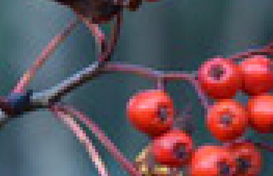
The image shows what a detail of a photograph looks like when enlarged to 800%, enough to see individual pixels. The image also shows artifacts caused by lossy JPG compression: These usually appear in areas where there are clear outlines on a smoother color field, such as branches against a background. (You will see the original image later on this page.)
- Crop the image tightly so that only the essential part is visible. You can re-crop existing images in an image editing program.
If you take the image yourself,- get close enough to the subject to crop the image appropriately. If you can’t get close enough, use the zoom if necessary.
- Ensure the image is sharp:
- Preferably use a tripod or otherwise stabilize the camera, or use image stabilization if your camera has it;
- Focus the image carefully on the desired subject. If you can influence the background, choose a calm background. If you can’t influence the background and have a system camera, you may be able to affect the depth of field depending on the shooting conditions: Choose a larger aperture to separate the subject from the background. Phone camera apps may also have similar features.

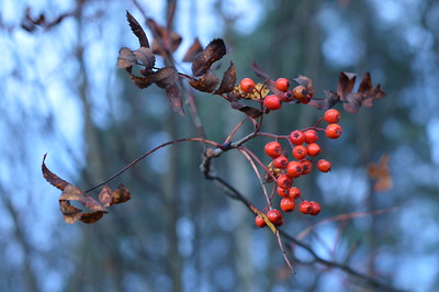
The rowan berries are photographed with a large aperture (ƒ/4.0), resulting in a narrow depth of field, making the subject stand out better against a blurred background. (The photo is taken by the author.)
- Take the photo preferably in good lighting (or use camera settings to compensate for low light conditions: for system cameras, this means a larger aperture (smaller f-number), higher sensitivity (larger ISO number), and/or longer shutter speed). If possible, natural light is best for color reproduction.
A good drawing is beautifully scalable SVG vector graphics
For example, see the coat of arms of Oulu as an SVG file (Wikimedia commons). Note that you can zoom in on the image without losing quality. When you view the same image as raster graphics (PNG), you will notice how the quality suffers when you enlarge the image on your screen. Zooming in on the screen is easiest with the keyboard shortcut CTRL and +. You can easily return to the original size with the keyboard shortcut CTRL and 0. Alternatively, you can try the scroll wheel on a mouse or pinch to zoom on a touchpad.
SVG is often the best format for all images except photographs on the web. However, it is still used relatively rarely: Not all editors accept SVG images (for example, this guide site does not allow SVG images), and not all programs used to create images can necessarily create them. One of the easiest programs available to everyone at Oulu universities for creating SVG images is PowerPoint.
- Use SVG images for vector graphics, such as various diagrams and computer-drawn images, where possible.
- SVG is also well-suited for displaying mathematical formulas on the screen when MathML is not supported.
When SVG is not possible, choose PNG
If you cannot create an SVG file of your image due to limitations of the programs you use, or if your drawing/diagram, etc., is already pixel-based (e.g., scanned or a screenshot), choose PNG as the image format.
PNG is raster graphics, meaning it is also pixel-based like JPG. PNG also compresses the image to a smaller file size. PNG differs from JPG in that it is lossless, meaning it does not compress images with loss like JPG. PNG’s limitation is the number of colors. If you can choose between PNG-8 and PNG-24 in an image editing program, choose PNG-8 if your image does not have many colors, as PNG-8 can handle 256 colors. If your image has color gradients, choose PNG-24, as it supports up to 16.8 million colors. PNG-8 images have a naturally smaller file size than PNG-24, so it is always worth choosing if the image quality allows it.
PNG was originally created to replace GIF. PNG images can also have transparent areas like GIF files. Use GIF images only if you cannot use anything else.
How to create a clear, good screenshot of for example, a computer program’s user interface for a user guide;
Nowadays, screen resolution is significantly better than before. The user’s screen settings, resolution, and physical size affect how images appear on the screen. You probably have a computer and a laptop, and the same content looks very different on a small phone screen compared to a larger computer screen. You can easily zoom in and out on your computer, but this typically applies to content, not desktop application interfaces. Zooming works well for web interfaces.
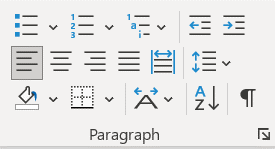
The example image below was taken from a laptop screen with a resolution of 1920 x 1080. The image size has not been changed in any way, and it looks good on the screen when taken from such a small area. Note that screenshots do not look good when printed because they have only 72 or 96 pixels per inch. This image, when printed at 100% size, would be about 7.3 cm wide and 3.9 cm high, but otherwise, it would not look good. If the resolution were changed to the ideal 300 pixels per inch for printing, the image size would be about 2.3 cm x 1.3 cm. If you were creating a printed guide for a web interface, it is advisable to zoom in about three times (300%) and take screenshots at that size, then change the image resolution to 300 pixels per inch in an image editing program, ensuring that the pixel dimensions do not change in the process.

Screenshot: Formatting Functions of a Paragraph in Word
- Set up the screen so that the areas you want to include in the screenshot are visible.
- You can adjust the window sizes if necessary: For example, by adjusting the width of the browser window, you can make the digital service interface more suitable for the screenshot.
- Full-screen screenshots are rarely needed, usually only for an overview of the entire interface.
- Instructional images should be tightly cropped to include only the essential part.
- In Windows, use the shortcut WIN+SHIFT+S to select the desired area on the screen. The image will be copied to the clipboard, and you can paste it into your image editing program. On a Mac, use the shortcut CMD+SHIFT+4, and the selected image area will be saved as a PNG file on your desktop.
- In an image editing program, you can add clarifying frames, arrows, etc., and cover personal information visible in the images, such as faces and names. You can also tidy up the image cropping.
- Avoid changing the size of the screenshot afterward; try to make the screenshot situation such that the image is usable with minimal effort. The problem with screenshots containing text is that if you change the image size, the text can easily become unclear if you are not careful. If you are using Photoshop, choose “Nearest neighbor (hard edges)” from the Resample options for screenshots of user interfaces.
- Save the image in PNG format.