1. Contrast requirements for the colour of the text and its background
The interpretation of the content must not be based on colours alone. For example, you must not just write that “the approved measurement results are marked in green and the rejected in red” because not all people can distinguish between these colours. You can use colours to support the message, but distinguishing between them must not be a prerequisite for understanding. The measurement results in the example could be easily corrected to be accessible just by adding the necessary information to the measurement result as a text (e.g. Accepted/Rejected). The colour coding could be retained, as it would be helpful for many people.
The contrast between the text and the background greatly affects the readability. A good contrast makes the text easier to read for visually impaired people and others as well. Usually, the easiest way to achieve this is to use the default colours, as long as they are accessible. If you have doubts about the default colours of the tool you are using, you can check the contrast between the colours or verify it with the administrator/manager of the service. Sometimes they can change the default colours to be accessible.
Examples of colour combinations
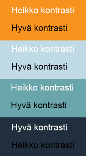
The example colours are orange (#f7931e), turquoise (#6aa6ab), a lighter version of turquoise (#c0dbe6), and a very dark cyan (#222f3e). If white text is overlaid on them, the accessibility contrast requirement is met only with the dark cyan. Therefore, white text should not be overlaid on the other example colours. Black text, on the other hand, creates a sufficient contrast with the orange and both the turquoise colours. (Note that logos are an exception: there are no contrast requirements regarding them.)
If you use other colours, you can check the colour combinations using WebAIM’s service.
Using an image as a background to text
Sometimes web pages include text overlaid on an image or part of an image. It is fine as long as the text stands out from the background. The background image should be fairly uniform in colour to ensure that the text stands out sufficiently everywhere. (Teacher: Pay special attention to this when creating an online course in Moodle and choosing the course cover image. Check that the name of the online course stands out sufficiently from the image.)


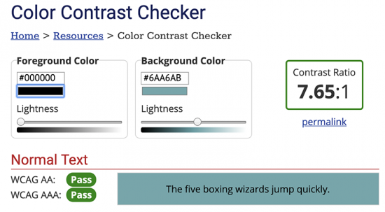
Accessibility requirements set measurable minimum values for contrast. For text and images of text, the contrast ratio between the text and its background must be at least 4.5:1 (level AA of standard WCAG 2.1). To check whether the colour combination meets the requirements, just enter the text and background colours in WebAim’s Contrast Checker as hex codes (e.g. black is #000000 and white is #FFFFFF). The service will indicate whether the colour combination passes the AA and AAA levels. We are required to pass at least the AA level.
Exceptions to the contrast requirements
- For large-scale text and images of large-scale text, the minimum contrast ratio is 3:1 (level AA).
- Text or images of text that are unimportant to the content of the page have no contrast requirements.
- Text that is part of a logo has no contrast requirement. (For example, Oamk’s orange logo on a white background does not meet the contrast requirements, and it does not have to.)
Examples
Black text on turquoise (#6AA6AB) background meets both the AA and the more demanding AAA contrast requirements. The contrast ratio between the turquoise and black is 7.65:1.
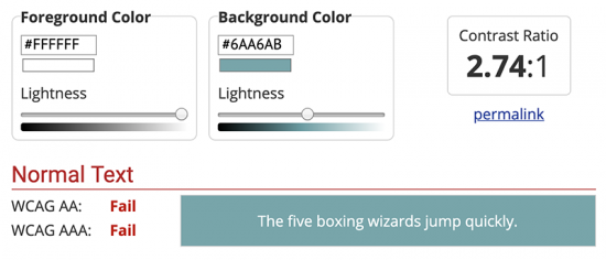
White text on the same turquoise does not meet the AA level contrast requirement. The contrast ratio between the white and turquoise is only 2.74:1.
2. Selecting colours for graphs
In particular, people with colour blindness have problems reading different graphs that are created without consideration of colour vision deficiencies. One way to check the contrasts is to convert the images to black and white: if the coloured areas are clearly distinguishable in black and white, they should be distinguishable to people with colour blindness.
The example shows two pie chart pairs: 1A & 1B and 2A & 2B. In the 1A version, the sectors are orange and turquoise. The 1B chart is the same graph converted in black and white, resulting in very poor contrast. The 2A chart has the sectors in orange and a very dark cyan. Even when converted to black and white (2B), they provide a clear contrast.
Line charts should primarily use different types of lines, with colours used only for added effect. Again, converting the chart to black and white provides a good indication of whether it is difficult or easy to read the chart.
If you are using a chart with fills, you can use different textures to support the colours or instead of the colours. Textures are a good option for accessibility. At the very least, check that the contrast is sufficient. It is easy to test by temporarily converting the chart to black and white.
The best readability is achieved by using 2D charts without any masking or other ‘gimmicks’. The simpler the chart is, the easier it is to understand.
If your charts include adjacent colour ranges, add outlines around the different elements (e.g. pie chart sectors) to make them more distinct. Preferably add legends next to or on top of what they refer to. This way, readers do not need to try to make sense of the different line types, fill colours or patterns to determine which legend refers to which element.